When products develop and mature beyond the MVP phase, it can be challenging to help users navigate the rapidly expanding surface area of features. If you have a menu that is becoming cluttered and unwieldy — and if users miss out on key features or fail to retain — then this is a sign that you need to re-define the core of how your product works. To do this, I’ve found that it’s useful to assess your product’s macro-organization and micro-organization.
Macro-organizational elements are interactions and interfaces that are common across a product. They are the repeated interactions that help users move from a high-level to a detailed process. The micro-organizational elements come into play once users are in this detailed flow state. As they are not repeatable, the use of these elements lend toward special cases and unique processes
Products are easier to use when we center the experience around the macro actions that enable users to seamlessly transition to micro-level detail. Below, I’ve collected some thoughts about what makes a strong organizational framework, and how to use this thinking to restructure a complex product into a simple, but powerful, process.
When products veer too far in either direction
Before we get to the ideal balance of organization, let’s talk about how not to structure a product. Here are some examples of when a product leans too heavily on micro or macro organization.
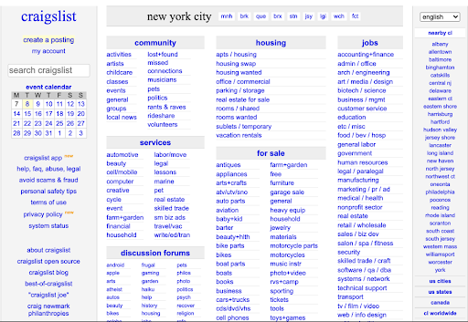
It’s easy, for example, to successfully micro-organize a product and in the process lose the macro picture. As mentioned above, a lot of young products follow this pattern. Teams add on more features and tests, creating detailed interfaces for each feature. Eventually, every additional interface requires users to learn new interactions, creating excess work to accomplish even simple tasks. With several features distributed in different places, users need to make unnecessary trips between features. In the worst case, users might not find critical features at all.

On the other side of the spectrum, products that oversimplify their tasks into too few interactions can sap user energy with unnecessary constraints. A tablet, while ideal for tasks like reading and writing, soon becomes overly tedious when dealing with editing and spreadsheets. Counterintuitively, the less simple mouse-and-keyboard approach is the smoother option for these tasks. When a tool oversimplifies, balance is lost, and with it goes the intended value.
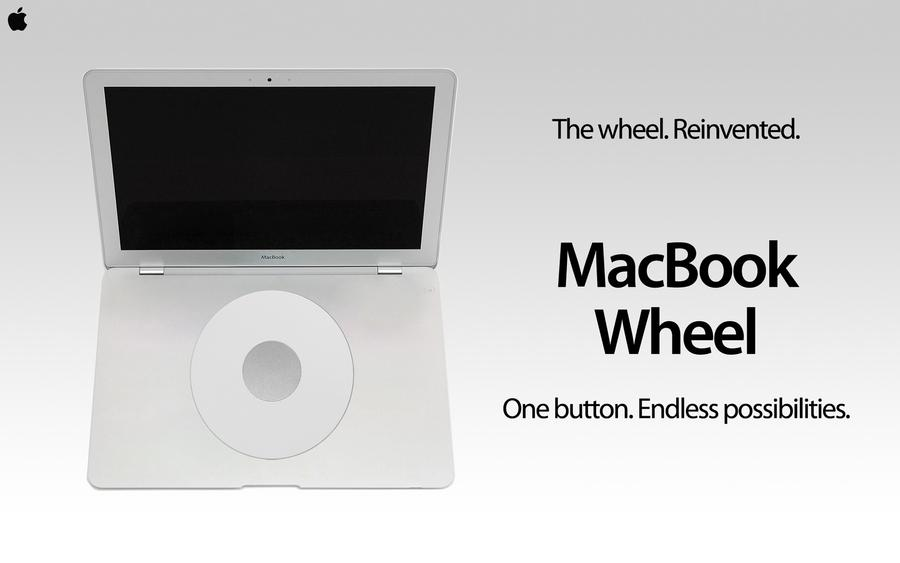
(For a humorous hypothetical example of an overly macro interface, check out this Onion report on the “MacBook Wheel.”)

To balance micro and macro, look for power actions
In a balanced product, creators structure their products around the most compelling, powerful interactions that enable users to access micro-level detail. I call these power actions. As a result, products are able to adapt to demand and user complexity without tiring users.
A ubiquitous example of this phenomenon might be the web search. The search (particularly the Google search) is the unifying organizational action for the internet because it can leverage algorithms to do the micro-organizing for us, delivering infinite, unique variations of detailed results in a simple, repeatable action.
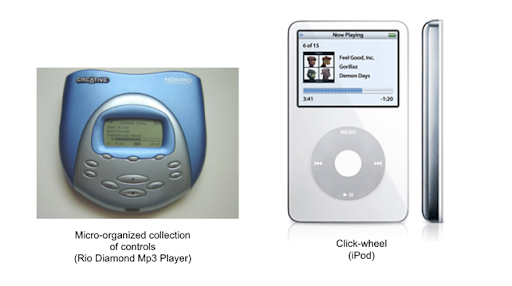
Great interfaces also centralize power interactions in one place. A historical example of this is the click-wheel from the iPod. The scroll-and-click interface with superimposed playback buttons makes it easy to switch between managing the playback of a current selection and browsing through hundreds of songs. Later, this centralized, multi-faceted approach allowed the iPhone to redefine the definition of user empowerment further. By fusing screen and interface, it allowed users to navigate the digital universe through simple, repeatable interactions.

How to develop a balanced macro and micro organizational approach
While we may not reach the level of a revolutionary interface like multi-touch, or build something of the magnitude of a new search engine, we can create powerful actions in every product — actions that allow users to sort through complexity instantaneously. As mentioned above, the goal is to look for repeatable, standardized sets of interactions. Make sure to look for those special interactions that accomplish a variety of tasks and provide tons of value.
First, assess how your product works today and what your uses seem to be doing constantly. Look for features that work together harmoniously and related tasks that can be consolidated. Then, try to find a few core options that users can repeat in order to smoothly navigate the whole.
Next, look for what your users are actually trying to accomplish. (This can be learned through user interviews, watching user sessions, and studying user pathways, among other things.) With this approach, you can find new organizational challenges a product isn’t currently solving, but has the ability to solve. This knowledge can help you invent more powerful interactions. Referencing back to the iPod, the creators probably noticed that users spent a lot of time searching for music on traditional Mp3 players. By introducing the scroll wheel, they gave users a supercharged interaction, requiring minimal effort to find the right song out of thousands of possibilities.
Finally, be willing to sacrifice the theoretical organization for practical functionality. Run usability tests and observe users working with your product. Also, be willing to scrap awesome-looking interfaces that don’t provide value. The goal of the process is to balance macro and micro in order to empower users, so if users aren’t empowered, products are likely out of balance.
Wrapping up
There are many frameworks and theories that can help us better organize our products, and this is by no means the end-all-be-all practice. But, by simply assessing our products by what is shared and what is unique, we can reorganize our products to better facilitate the most essential value without sacrificing the nitty-gritty. This doesn’t just enable us to create more organized products; it enables us to create more empowering ones, too.
About the speaker
David Prentice is a Product Manager who is happiest when actualizing ambitious visions, fine-tuning high-quality user experiences, streamlining complex interfaces into simple interfaces, learning by talking with customers, binge-building dashboards, collaborating with cross-functional teams, and shipping products that make a meaningful improvement in the lives of their users. He currently works at CollegeVine, an education startup dedicated to bringing high-quality college guidance to every family, and has led the creation of a new app to help students optimize their college choices. Prior to CollegeVine, he managed brand, platform, and research teams at two of the world’s largest online travel companies. PM-life aside, David is a music, art, and history nerd, who lives in Boston with his girlfriend and three cats.